As much as it looks effortless, beautifying a space involves following a lot of rules. It’s a game of do-this-not-that in every aspect—choosing colour palettes, arranging furniture, and leaving certain spaces in the house empty. However, as in other aspects of life, age-old rules get obsolete. You can break them in any way, and the design police won’t budge. Still, there are rules that remain applicable today. They are worth following to achieve a visually appealing space. That said, here are some traditional decorating rules revisited. You’ll know whether to ditch them altogether or fetch and stick to them all the same.
Avoid bright colours in the bedroom.
Verdict: Fetch!
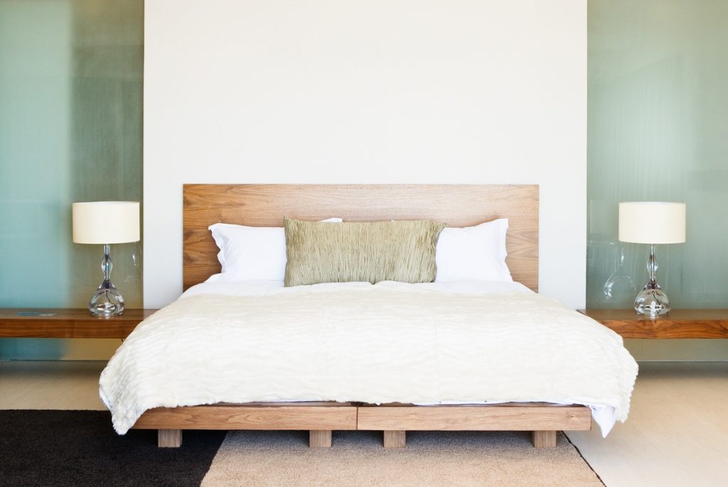
This is a timeless rule. Bedrooms are supposed to have a calming atmosphere. Bright colours, such as red and orange, stimulate the brain. Therefore, they shouldn’t be in the area where you rest and sleep, at least not as the main colour in your palette. Instead, go for cool tones, such as green and blue, or neutrals, such as black, white, ivory, and beige, as they help in creating a relaxing atmosphere. To avoid the visual monotony of cool tones and neutrals, play with different textures. Introduce wood, glass, steel in your design. Take inspiration from most homeowners who use cavity slider sets to match their barn or glass doors. This variety of textures can create points of visual interest in cool-toned or neutral-coloured rooms.
Don’t use bold patterns in narrow spaces.
Verdict: Ditch!
Most people think that such decorations can make the space look smaller. But that’s not true. In fact, you can make a narrow hallway seem bigger if you use huge, thick horizontal stripes across that space because it will lead the viewer’s eyes to the end of that space. Don’t be afraid to use bold patterns in narrow spaces. If you don’t want to use wallpapers, create a mini-gallery in that area, hanging different photos of your family framed in different sizes. These will be points of visual interest, distracting people from the fact that they’re in a narrow space.
Use small furniture in small rooms.

Verdict: Fetch! (with a twist)
Applying the principle of scale and proportion, it makes sense to use smaller furniture in limited spaces. Pieces that are too big will not just cramp the space but also make furniture choice seem like it’s done haphazardly. Matching the size of the pieces you put in the space to the actual dimensions of the area is an important rule in decorating. But while small pieces go with small spaces, some interior designers also recommend using fewer elements that have several functions. For instance, there is seating furniture that can also serve as storage areas. This saves floor space, therefore giving the illusion of a more expansive room.
Stick to one style of design.
Verdict: Ditch!
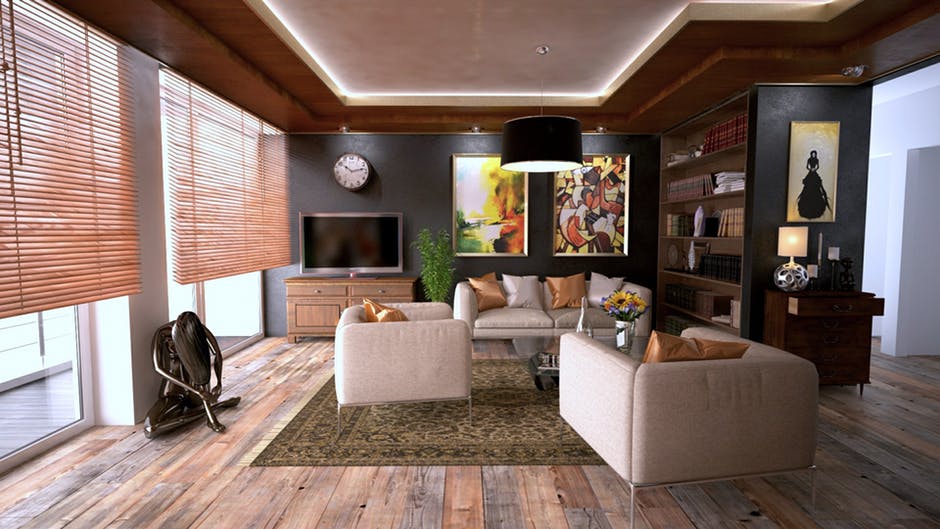
Most people think that if they go for the classic design, they go classic through and through and never toy with the idea of adding modern pieces. This rule is supposed to tie the whole design together and make it look more cohesive. But what it also does is that it makes the space boring and so put-together that it looks staged. Hence, go ahead and mix traditional and modern. Find period furniture pieces, then complement them with contemporary lighting fixtures and rugs. This will add newness to your design.
Rules rule in interior design. But learn also which to toss out and which to swear by. That’s the best way to pull off your home improvement project.


